Case – Live connecting to visual studio analysis service tabular project via Power BI.
Why this
has happened
In some cases we have millions of data which is practically impossible to load into Power BI. In such situation it is easier to live connect the data with Power BI for faster data retrieval and analysis.
In some cases we have millions of data which is practically impossible to load into Power BI. In such situation it is easier to live connect the data with Power BI for faster data retrieval and analysis.
What are
needed and why are they needed
You need to have Microsoft SQL Server Management Studio for managing the databases and tables also you need Microsoft Visual Studio to create an analysis tabular project also along with that you need Power BI to live connect to the tabular project for reports and dash board creation.
You need to have Microsoft SQL Server Management Studio for managing the databases and tables also you need Microsoft Visual Studio to create an analysis tabular project also along with that you need Power BI to live connect to the tabular project for reports and dash board creation.
Microsoft SQL Server Management Studio
Creating SQL Server Authentication
First you need to start Microsoft SQL Server Management Studio and create a new SQL server authentication. In order to do this first login with your windows authentication which does not require any password to connect.
First you need to start Microsoft SQL Server Management Studio and create a new SQL server authentication. In order to do this first login with your windows authentication which does not require any password to connect.

As shown in the above image select New Login from Logins
which is in the security option.

Create a new user as shown above, I have created a new user
named TestUser while selecting “public” and “syadmin” from the “Server Roles”
which you can find in the “Select a page” option in the top left
corner of the above image.

Now login again with the SQL Server Authentication credentials for the TestUser in
Microsoft SQL Server Management Studio.
Creating a Tabular Project in Visual Studio
Now it is time to create a new tabular project in visual studio and connect it to a database in Microsoft SQL Server Management Studio using the credentials of TestUser.
Now it is time to create a new tabular project in visual studio and connect it to a database in Microsoft SQL Server Management Studio using the credentials of TestUser.
Start the Visual Studio and in the left corner of the task bar
click “file” and select “new” which is the first option you will find, then
select “project”. If you follow the above steps you will get the following
visual.

As shown in the above image select analysis service from
Business Intelligence then select Analysis Service Tabular project which is the
second option, I named the new tabular project as TestUserTabularProject. Once
you press ok it will ask for a selection for analysis service instance and
compatibility level which we are not going to look in more depth but select the
integrated service which is much preferred for analysis service instance and
leave the default option chosen for compatibility level.
Connecting the tabular project to a database in Microsoft SQL Server Management
Studio
Once you have created the tabular project you need to get data to it. In order to do this you need to press the barrel symbol icon found in the task bar, now I will give a screen shot of the task bar and try to find it yourself.
Once you have created the tabular project you need to get data to it. In order to do this you need to press the barrel symbol icon found in the task bar, now I will give a screen shot of the task bar and try to find it yourself.
Can you notice the icon I’m saying in the second task bar, which is third from the green triangle start option?
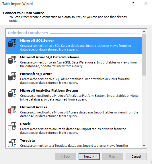
Now click that icon which is actually “connect to data source
option” and there choose Microsoft SQL server as shown below and press next.
Once you have clicked next as shown above you will get the following
option pane.

As shown in the above image select all the respective fields
and give your login credentials for SQL server authentication. Once you are
done then select Test Connection in order to verify that the connection is established with the SQL server
then select a data base of your choice which you have in your SQL server, in my
case I have a Make-a-Mammal database and I have successfully connected to it. If you don’t
have any database then you can also create a new one in SQL server management studio and then
select it from here.

Once you press next you will be asked to specify the
credentials to be used by the analysis server to connect to the data source and
there you have four options but for this case let us choose the credential
of the “SERVICE ACCOUNT” and then press next.

Once you press next you will be asked how you would prefer to
load data, for this case let us go with “Select from a list of tables and
views to choose the data to import” and then press next, we can select the tables and views that are to be imported in the next step.
Finally you will be directed to select the tables of your choice from the list of tables and views available in the
database, in this case I have selected all the available tables by pressing the
icon next to the heading "source table" as shown below and then pressed finish.

Once I pressed finish all the tables will be loaded as
shown below and then close it.

Now the tables and rows have to be deployed to the tabular
project, in order to do this just press the start icon in the second task bar with
the green triangle icon in visual studio which will result as following.

Live connecting the tabular project to Power BI
Now it’s time to live connect with the tabular project, in order to do this we need to select get data from the data source and select “SQL Server Analysis Services database” from the whole range of data sources available.
Now it’s time to live connect with the tabular project, in order to do this we need to select get data from the data source and select “SQL Server Analysis Services database” from the whole range of data sources available.

Once you select connect you will be displayed with the
following.

Here you need to select the server name in this case it is
the name of my computer because I’m using it as my server, then I selected “Connect
live option” and clicked ok which will direct me to the following display.

Now you can see the tabular project we have created named TestUserTabularProject, now select it and press "OK" to live connect with that tabular project
from Power BI.

Now you can see we are live connected and the tables are
loaded in the right from the tabular project and also you can see a text saying "Live Connection:
Connected" in the bottom right corner in Power BI.
Limitations
of Live Connection
As you can see there is no edit query option when you are live connected also you cannot view the tables or manage their relationships but you can create a new measure which is really useful. The main usage of live connection is to manage a large set of data in faster phase where importing takes too much time.

As you can see there is no edit query option when you are live connected also you cannot view the tables or manage their relationships but you can create a new measure which is really useful. The main usage of live connection is to manage a large set of data in faster phase where importing takes too much time.
Comments
Post a Comment